
What You’ll Find in This Guide
- Why white paint is harder to choose than any other color
- How we tested these paints (our process)
- Best white for living rooms
- Best white for bedrooms
- Best white for kitchens
- Best white for bathrooms
- Best white for home offices
- Best white for dark or north-facing rooms
- Best white for exteriors
- Understanding undertones (the key to everything)
- Warm white vs cool white: which is right for you?
- How to sample white paint like a pro
Why Choosing White Paint Is Harder Than Any Other Color
Most people assume white is easy. It’s neutral. It goes with everything. Just pick any white and call it a day.Here’s what no one tells you: there are over 150 variations of white in most major paint brands. Each one has a different undertone — yellow, pink, green, gray, purple, or blue. And those undertones behave wildly differently depending on your room’s light source, the direction your windows face, your flooring, your furniture, and even the color of your neighboring rooms.A paint that looks like a perfect crisp white in the store will look lavender in a north-facing room. A warm creamy white that looks dreamy in a magazine bedroom will look like a nicotine stain in a kitchen with fluorescent lighting. This is not an exaggeration. This is paint science, and it is ruthless.The biggest mistake homeowners make is choosing a white paint from a tiny chip at the paint store under artificial fluorescent lighting, then wondering why it looks completely different on their walls. Paint chips are not accurate. Room samples are not optional — they are essential. But more on that later.The second biggest mistake? Not knowing your room’s undertone needs. Every room has a “color personality” based on its light. Knowing that personality tells you exactly which undertone of white will work — and which ones will embarrass you.
How We Tested These White Paints (Our Real Process)
I want to be upfront about how I arrived at these recommendations, because I think methodology matters. Over two years, I tested paints in my own home across multiple rooms. Every paint I recommend, I actually put on a wall — large sample boards, at least 12″x12″, observed at three different times of day: 8am, 12pm, and 5pm.For each room, I noted the window direction (north, south, east, or west), the primary light source (natural, LED warm, LED cool, fluorescent), the flooring type, and the dominant furniture colors. I then sampled 3–6 whites per room and observed them for at least 3 days before making a final call.I also consulted with two professional color consultants — one who works primarily with Sherwin-Williams, one independent — to cross-reference my selections. The results were surprisingly consistent.The paints in this guide come from Sherwin-Williams, Benjamin Moore, Farrow & Ball, and Behr. I’ve included budget options and premium options. I’ve also included the LRV (light reflectance value) for each — a number between 0 and 100 that tells you how much light a paint reflects. Higher LRV = brighter room.
Best White Paint for the Living Room
🏆 Top Pick: Benjamin Moore Chantilly Lace (OC-65)
If there is a “perfect white,” Chantilly Lace comes closest for living rooms. It is a pure, crisp white with no dominant undertone — it just reads as clean, bright white in almost any lighting condition. LRV is 92.2, which means it reflects a massive amount of light and makes rooms feel noticeably larger and airier.In my south-facing living room, Chantilly Lace stayed true white from morning to evening. Even when the golden afternoon light poured in, it didn’t pick up yellow — it just glowed. It paired beautifully with our warm oak floors and gray linen sofa, making both colors feel intentional rather than accidental.One important caveat: because Chantilly Lace is so clean and bright, it will show dirt, scuffs, and imperfections more than a creamier white. Use an eggshell finish (not flat) in living rooms so you can wipe the walls down. And if your living room gets very little natural light, this white may read slightly cold — in which case, consider the runner-up below.
Runner-Up: Sherwin-Williams Alabaster (SW 7008)
Despite my yellow-undertone trauma (mentioned above), Alabaster is genuinely one of the best warm whites available — when used in the right room. In living rooms with north or east-facing windows, where light is cooler, Alabaster’s warm yellow undertone counterbalances the coldness and creates a cozy, inviting atmosphere. In south-facing rooms with warm light, skip it. But in the right conditions, it is absolutely stunning.
Best White Paint for the Bedroom
🏆 Top Pick: Sherwin-Williams Alabaster (SW 7008)
Yes, the very paint that made me cry in my living room became my absolute favorite for bedrooms — and this distinction taught me the most important lesson in this entire guide: context is everything.Bedrooms benefit from warmth. They’re spaces where we want to feel safe, cocooned, and relaxed. A stark, cold white in a bedroom can make the space feel clinical rather than restful. Alabaster’s warm yellow-ivory undertone is perfect here — it creates a soft, candlelit quality that makes you want to sink into bed.When I repainted our master bedroom with Alabaster, the transformation was immediate. The room, which had previously felt stark with a cool gray-white, suddenly felt like a boutique hotel — warm, enveloping, and deeply relaxing. We paired it with linen bedding, warm wood nightstands, and soft gold hardware, and the combination was everything I’d been trying to achieve.
Runner-Up: Benjamin Moore White Dove (OC-17)
White Dove is one of the most popular whites in interior design — and for good reason. It’s a soft, warm white with very gentle undertones that lean slightly creamy without ever looking yellow. LRV is 85.4, which is bright but not blinding. It works beautifully in bedrooms with various light conditions and pairs well with both warm and cool furniture tones. If Alabaster feels too warm for your space, White Dove is the perfect middle ground.
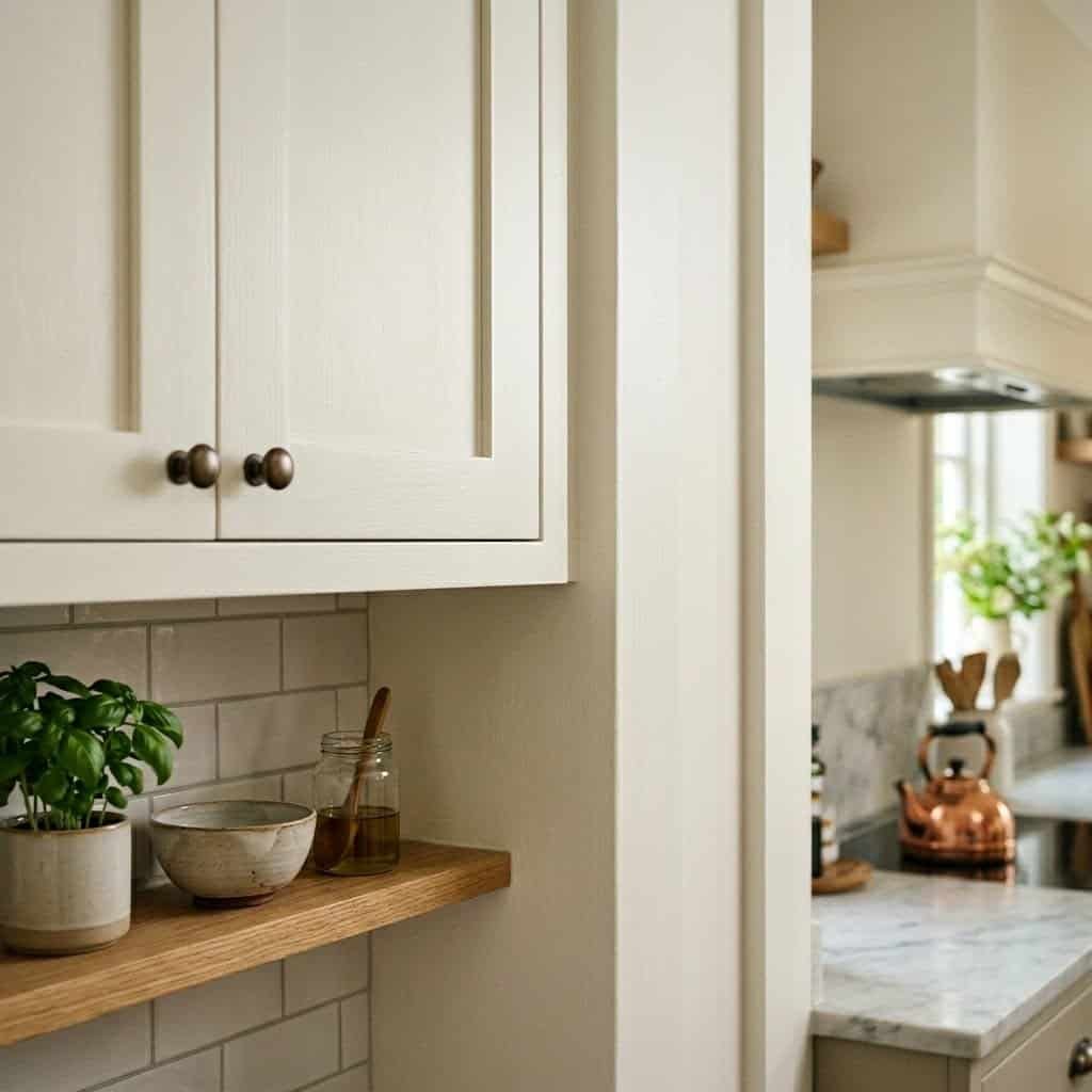
Best White Paint for the Kitchen
🏆 Top Pick: Benjamin Moore Chantilly Lace (OC-65)
Kitchens need to feel clean. That’s non-negotiable. And for that reason, warm creamy whites that work beautifully in bedrooms often fail miserably in kitchens — they can make the space look dingy, especially under the mix of warm and cool artificial lighting most kitchens have.Chantilly Lace is perfect for kitchens because its clean, pure white reads fresh and hygienic without being cold. On white cabinetry, it makes the kitchen look sharp and intentional. Against warm wood lower cabinets (a very popular look right now), it creates a beautiful contrast that feels both modern and timeless.For kitchen walls specifically, use semi-gloss or satin finish — these are easier to clean, more resistant to moisture and grease, and hold up well over time. I repainted my kitchen in Chantilly Lace (walls and upper cabinets) and it completely transformed the space. What was once a dark, heavy kitchen became bright and welcoming — and it photographed beautifully for our home listing photos.
Runner-Up: Sherwin-Williams Pure White (SW 7005)
Pure White is slightly warmer than Chantilly Lace but still clean and crisp — a great option if you find Chantilly Lace just a hair too stark. It has an LRV of 84 and pairs well with both all-white kitchens and two-tone cabinet schemes. It also works well with stainless steel appliances without looking cold or clinical.
Best White Paint for the Bathroom
🏆 Top Pick: Benjamin Moore Decorator’s White (CC-20)
Bathrooms are unique because they often have very specific, sometimes harsh lighting — recessed lights, vanity lights, or small frosted windows. In these conditions, many whites take on strange undertones. Decorator’s White is one of the cleanest, most honest whites available — it reads true white under almost any artificial or natural light condition.LRV of 86.85 means it reflects a lot of light, which is crucial in bathrooms that may not have the best natural light. It also works wonderfully against white tile (which has its own undertones), white fixtures, and chrome hardware. One of my interior designer contacts calls Decorator’s White her “foolproof bathroom white” — and after testing it in three of my own bathrooms, I completely agree.For bathrooms, always use a semi-gloss or high-gloss finish. This is not optional — flat or eggshell paints in bathrooms will absorb moisture, resist cleaning, and peel within a year. Semi-gloss holds up to steam, humidity, and cleaning products beautifully.
Runner-Up: Farrow & Ball All White (No. 2005)
If you want a more premium, nuanced look in your bathroom, Farrow & Ball’s All White is exceptional. It has a very slight cool blue-white undertone that feels clean, crisp, and spa-like. It’s particularly stunning in bathrooms with white subway tile and polished chrome fixtures. Fair warning: Farrow & Ball is expensive (around $115/gallon), but the depth and quality of their paint is genuinely unmatched — one coat covers beautifully, and the finish has a richness that cheaper paints simply can’t replicate.
Best White Paint for the Home Office
🏆 Top Pick: Sherwin-Williams Extra White (SW 7006)
Home offices have specific needs: you need to focus, you need good light quality for screens and video calls, and you want the space to feel productive without being sterile. Extra White by Sherwin-Williams delivers all of this.With an LRV of 86, Extra White is extremely bright — one of the brightest whites in the Sherwin-Williams lineup. It has a very subtle cool undertone that actually helps with screen glare (warm whites can create visual noise around monitors). On video calls, Extra White backgrounds look clean and professional — far better than the warm creamy whites that can make you look slightly jaundiced on camera.In my own home office, I tested Extra White against Chantilly Lace and found that Extra White provided better “visual quiet” — the walls just disappeared, letting me focus on my work. For a home office with built-in shelving, this white is also perfect because it makes the shelves feel like they’re part of the wall rather than a separate element.
Runner-Up: Benjamin Moore Simply White (OC-117)
Simply White is one of Benjamin Moore’s bestsellers, and it earns that title. It’s a warm white with just enough creaminess to feel comfortable, but bright enough (LRV 91.7) to keep a workspace feeling energized. If you find Extra White too cold for your office, Simply White is a warmer alternative that still photographs beautifully for video calls.
Best White Paint for Dark or North-Facing Rooms
🏆 Top Pick: Benjamin Moore White Dove (OC-17)
Dark rooms and north-facing rooms are the most challenging scenario for white paint. North-facing rooms receive no direct sunlight — they rely on reflected sky light, which is naturally cool and blue-toned. In these conditions, cool whites like Chantilly Lace or Extra White will look cold, stark, and even slightly blue-gray. The room will feel like a refrigerator.The solution is to fight the coldness with warmth. White Dove’s gentle creamy undertone counterbalances the cool blue light and makes north-facing rooms feel cozy and inviting rather than gloomy. This is the white I used in our north-facing dining room, and it was genuinely life-changing for that space. What had been a room we avoided became one of our favorite rooms in the house.The key with dark rooms is also sheen — use an eggshell or satin finish rather than flat, as the slight sheen helps reflect what light is available and keeps the walls from looking flat and absorptive.
Runner-Up: Sherwin-Williams Creamy (SW 7012)
Creamy is the most warmly-toned white on this list — it’s almost ivory. In north-facing rooms or rooms with very little natural light, it works like magic. It has a golden warmth that makes a room feel lit from within, even on a gray day. It pairs beautifully with natural wood tones and warm-colored textiles. If White Dove isn’t warm enough for your particularly dark room, step up to Creamy.
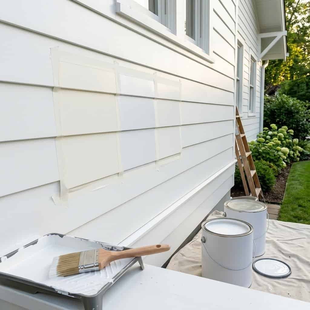
Best White Paint for Exteriors
🏆 Top Pick: Benjamin Moore Chantilly Lace (OC-65)
For home exteriors, the rules change significantly. Natural outdoor light is the brightest, most revealing light source possible — it will expose every undertone in a paint. Soft creamy whites that look beautiful inside can look almost yellow on an exterior in full sun. For most exterior applications, you want a paint that reads as clean, bright white in full sunlight.Chantilly Lace is my top pick for exteriors because it stays true white under full sun exposure without looking harsh or stark. Our neighbor painted their colonial with it after seeing our interior results, and the curb appeal transformation was remarkable. For exterior use, make sure you’re using an exterior-grade paint (not the same formulation as interior) — the pigment ratios differ, and exterior formulations are designed to resist UV fading, moisture, and temperature changes.
Runner-Up: Sherwin-Williams Alabaster (SW 7008) — For Warm-Toned Homes
If your home has warm architectural elements — brick, warm-toned stone, cedar shingles, or warm wood accents — Alabaster’s creamy warmth on the exterior creates a cohesive, charming look. It’s a popular choice for farmhouse-style homes and traditional colonials with natural material accents. In full sun, Alabaster does pick up a warm golden tone outdoors — but on the right home, this reads as intentional and beautiful rather than yellow.
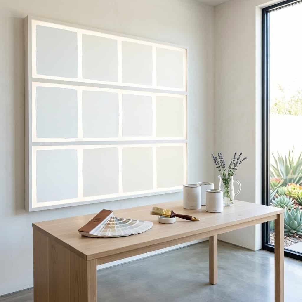
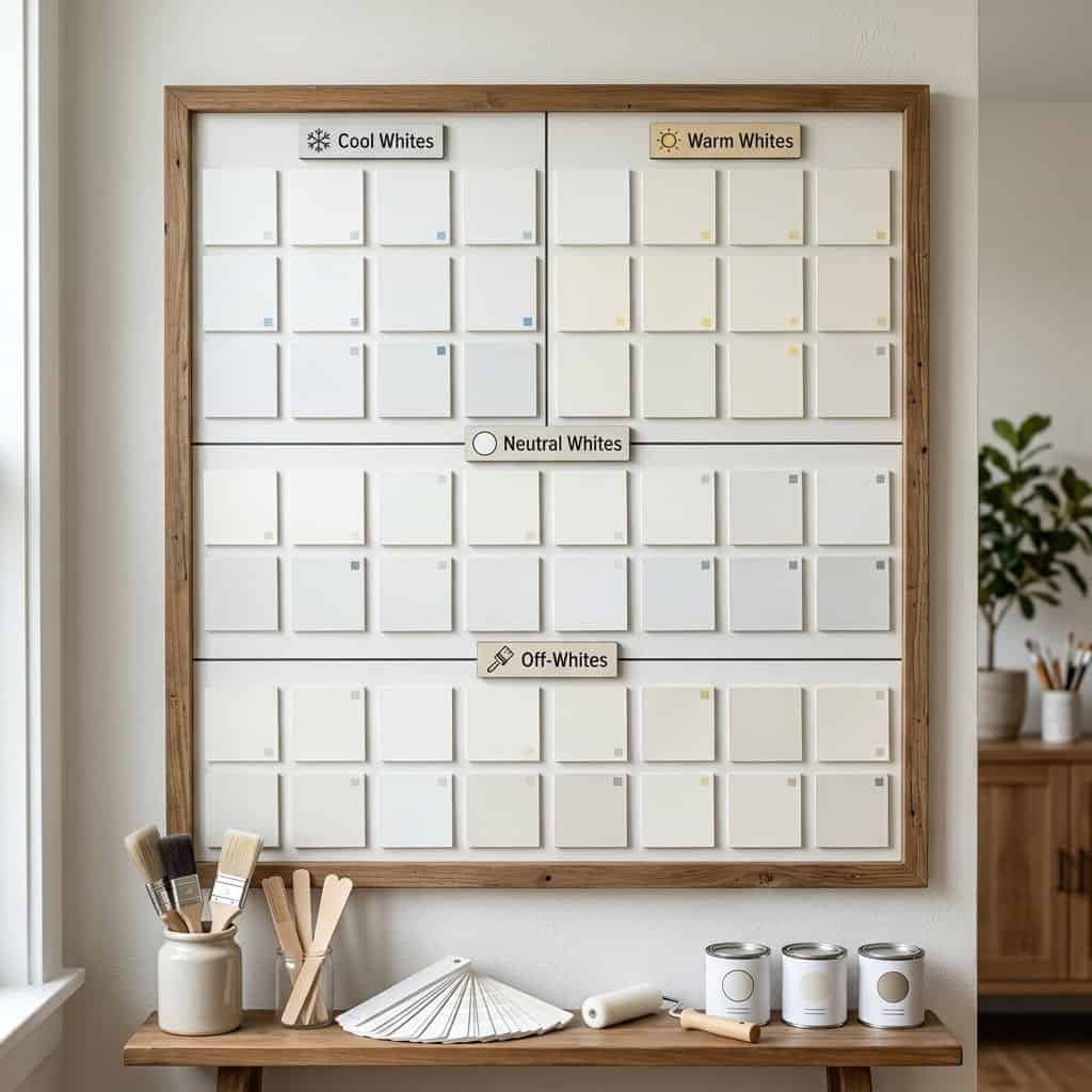
Understanding Undertones: The Key That Unlocks Everything
I’ve mentioned undertones throughout this guide, but I want to dedicate a full section to this concept because it is — without question — the most important factor in choosing white paint. Once you understand undertones, white paint selection becomes almost scientific rather than guesswork.Every white paint has a base undertone. The most common are:
- Yellow/Warm undertones — Makes whites look creamy, cozy, and warm. Examples: Alabaster, Creamy, White Dove.
- Pink undertones — Creates a soft, rosy warmth. Often shows up in “bright whites.” Can look great or look like primer depending on the room.
- Green undertones — The sneakiest undertone. Greens are often invisible in neutral conditions but appear strongly in certain light. Avoid in rooms with cool natural light.
- Gray undertones — Creates a cool, contemporary look. Works beautifully in modern spaces but can feel cold in dark rooms.
- Blue undertones — The most contemporary cool white. Great for modern, coastal, and Scandinavian aesthetics. Struggles in north-facing rooms.
- Purple undertones — Rare but present in some whites. Usually only visible under specific lighting but can be startling when it appears.
The easiest way to identify a white’s undertone? Place it next to a piece of pure white printer paper. The comparison immediately reveals whether a white is warm, cool, or neutral. If it looks yellow next to the paper — it has warm undertones. If it looks blue — cool undertones. If it matches the paper almost exactly — it’s a true neutral white.The second method: hold the paint chip up against a gray surface (like a concrete wall or gray cardboard). Gray is completely neutral, so it won’t push the undertone in either direction — whatever undertone the white has will become clearly visible against gray.
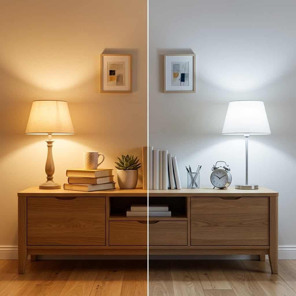
Warm White vs Cool White: Which Should You Choose?
This is the most common question I get, and the answer depends on four factors: your room’s light, your flooring, your furniture palette, and the feeling you want to create.
Choose warm white if: Your room faces north or east (limited direct sunlight), you have cool-toned floors like gray hardwood, stone, or tile, your furniture is dark or mid-toned, or you want the room to feel cozy and inviting. Warm whites are forgiving, flattering, and make spaces feel lived-in and comfortable.
Choose cool white if: Your room faces south or west (abundant direct sunlight), you have warm-toned floors like honey oak or warm wood, your furniture is already warm in tone, or you want the room to feel crisp, modern, and airy. Cool whites push back against warmth in the room, creating balance and visual freshness.
Choose true neutral white if: You’re uncertain about your room’s light conditions, you have a mix of warm and cool furniture, you want maximum flexibility, or you’re painting to sell your home (neutral whites appeal to the widest audience). Chantilly Lace and Benjamin Moore Decorator’s White are the closest things to true neutral whites available.
One final note: if you’re painting an open-plan space where multiple rooms flow together, use the same white throughout for visual cohesion. Mixing warm and cool whites in adjacent spaces creates a jarring visual mismatch — even if the individual rooms look great, the transition between them will feel wrong.
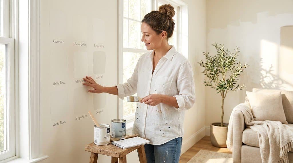
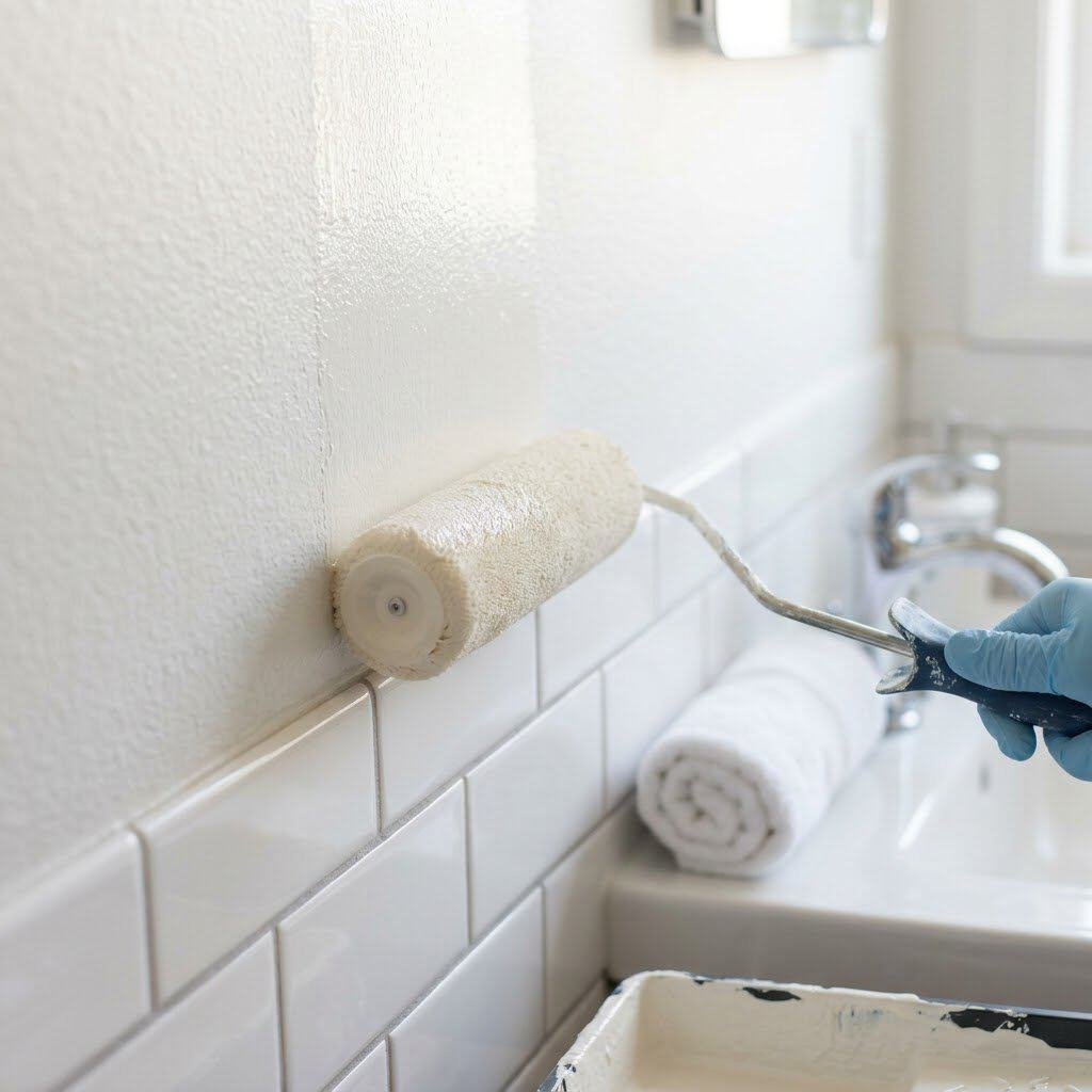
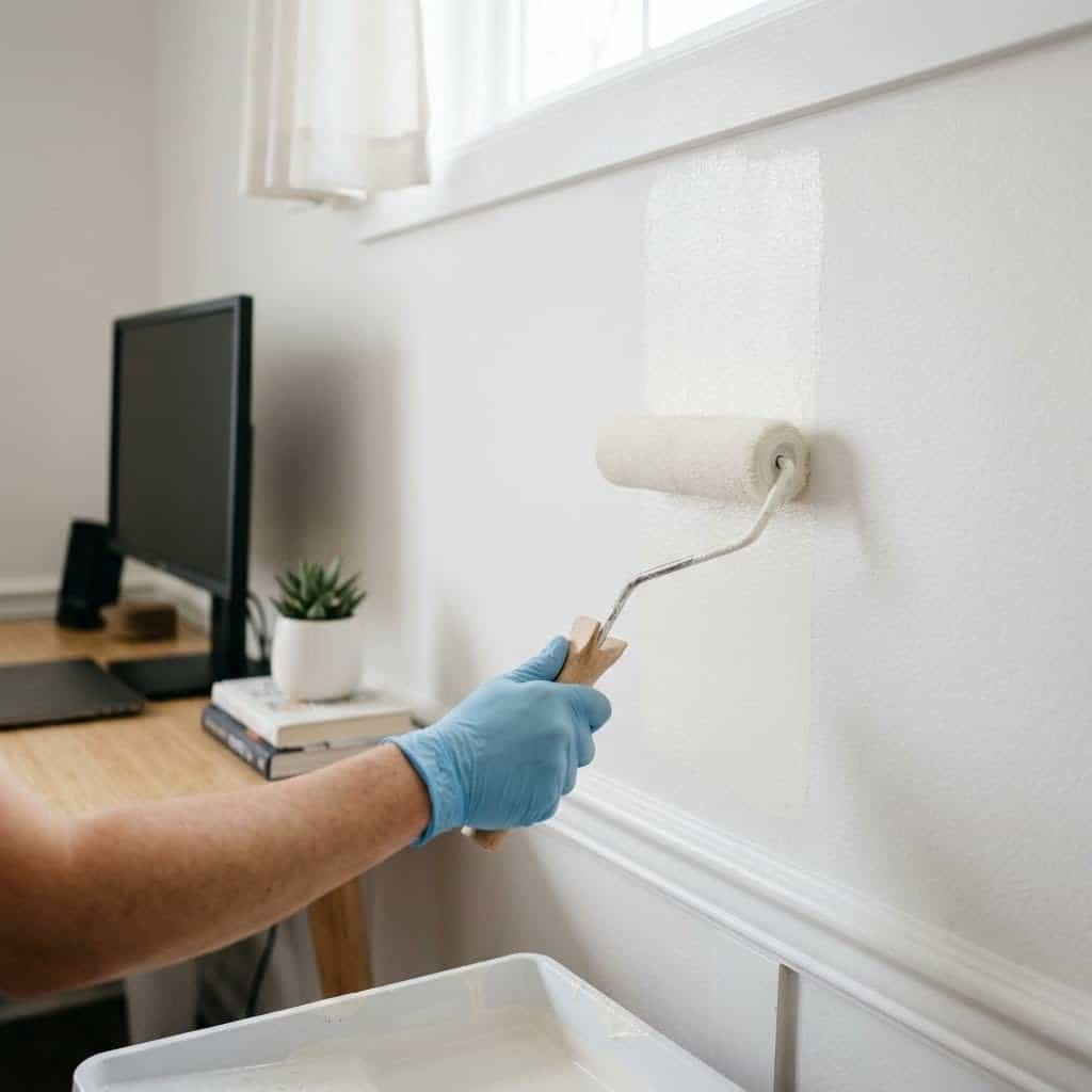
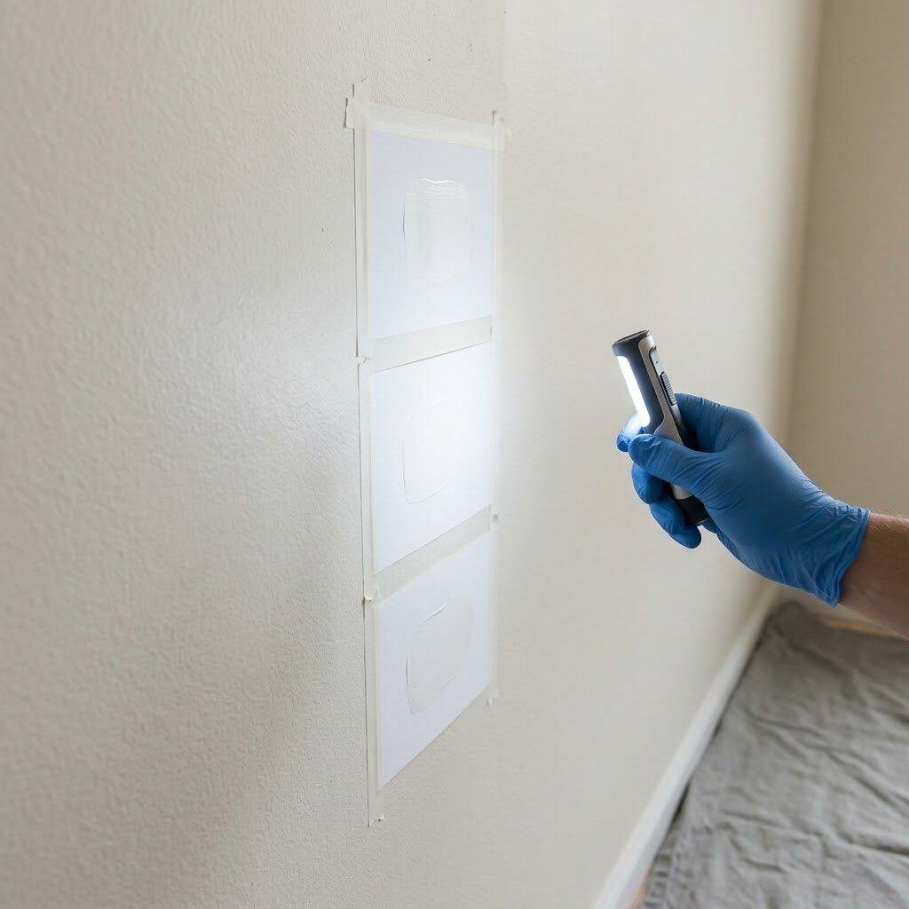
How to Sample White Paint Like a Pro (The Step Most People Skip)
Sampling is the single most important step in the paint selection process, and it’s the step that most people either skip or do incorrectly. Here is the exact method that professional color consultants use — and that I’ve now used in every room of my home.
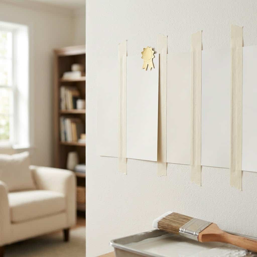
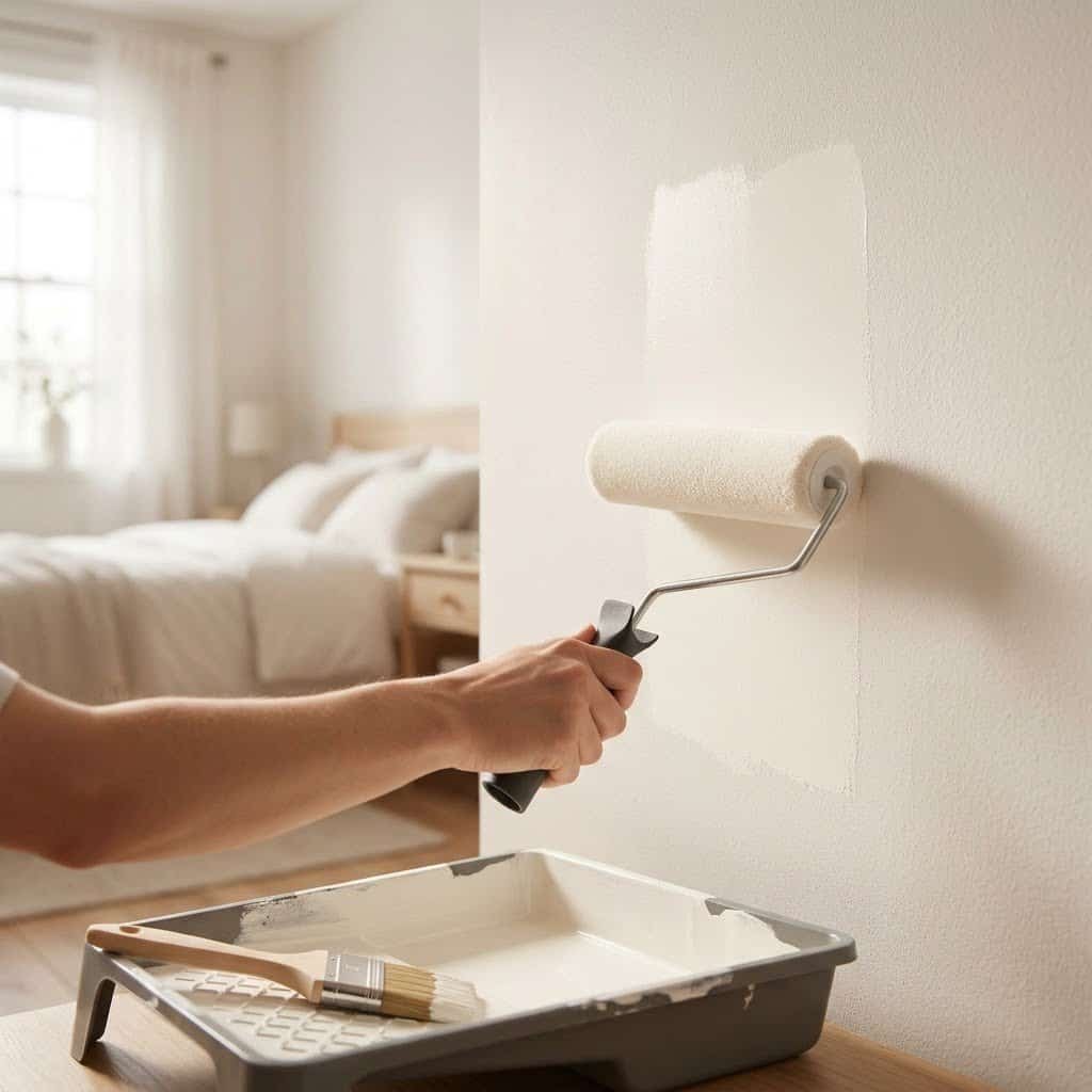
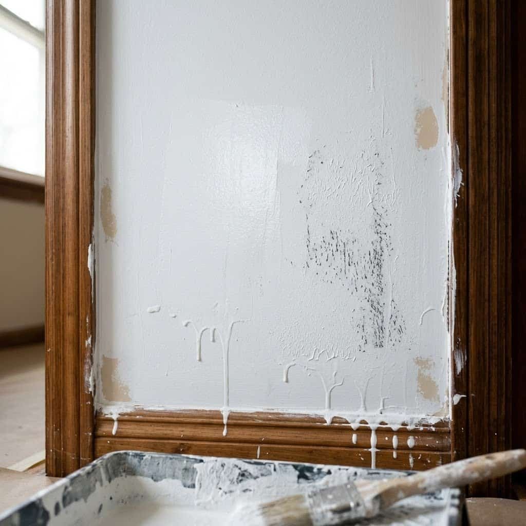
Step 1: Get actual samples, not chips. Paint chips are tiny and printed — they don’t represent paint accurately. Order sample pots (most brands sell 4 oz or 8 oz samples) and actually apply them to your wall. This is non-negotiable.
Step 2: Apply to a large area. Paint a section at least 12 inches by 12 inches — ideally larger, like 18 by 18 inches. Small swatches lie. A larger area gives you a much more accurate read of how the paint will look at scale.
Step 3: Apply two coats. One coat of paint is semi-transparent and will not show you the true color. Always apply two coats to your sample.
Step 4: Paint multiple samples on the same wall. Having your top 3 whites side by side on the same wall — in the same light conditions — is the fastest way to see differences and make a confident choice.
Step 5: Observe at three times of day. Check your samples at morning light (8–9am), midday (12–1pm), and late afternoon (4–5pm). Note how the color shifts at each time. The time of day when you use a room most should carry the most weight in your decision.
Step 6: Don’t compare against your current wall color. Your existing paint will influence how you perceive the sample. If possible, paint samples over a neutral gray base, or at minimum, try to view them in isolation rather than comparing them to the existing color.
Step 7: Live with it for 48 hours. Give yourself two full days before deciding. I’ve been surprised more than once by a paint that looked great the first day and showed a strange undertone the second day at a particular time. Patience pays off here.
Quick Reference: The Complete White Paint Cheat Sheet
Here is a quick summary of all my top picks by room:
- Living Room: Benjamin Moore Chantilly Lace (OC-65) — LRV 92.2 — Crisp true white
- Bedroom: Sherwin-Williams Alabaster (SW 7008) — LRV 82 — Warm cozy white
- Kitchen: Benjamin Moore Chantilly Lace (OC-65) — LRV 92.2 — Clean bright white
- Bathroom: Benjamin Moore Decorator’s White (CC-20) — LRV 86.85 — True neutral white
- Home Office: Sherwin-Williams Extra White (SW 7006) — LRV 86 — Bright cool white
- Dark/North-Facing Rooms: Benjamin Moore White Dove (OC-17) — LRV 85.4 — Warm soft white
- Exterior: Benjamin Moore Chantilly Lace (OC-65) — True white for curb appeal
Common White Paint Mistakes (And Exactly How to Avoid Them)
After two years of testing and consulting, I’ve catalogued the most common mistakes homeowners make with white paint. Here they are — so you can skip straight to the right answer.
Mistake #1: Choosing based on paint chips alone. As mentioned above, paint chips are not reliable. They’re small, printed rather than painted, and viewed under store fluorescent lighting. Always sample.
Mistake #2: Painting all rooms the same white. This seems logical — one white, whole house, done. The problem is that different rooms have different light conditions, and one white will not behave the same in all of them. The Alabaster that looks beautiful in your bedroom may look dingy in your kitchen. Always assess each room individually.
Mistake #3: Ignoring the finish. The finish (flat, eggshell, satin, semi-gloss, gloss) changes how the paint looks and performs dramatically. Flat absorbs light and hides imperfections but is nearly impossible to clean. Eggshell has a slight sheen and is cleanable — perfect for living rooms and bedrooms. Satin is more durable and slightly shinier — good for hallways. Semi-gloss is easy to clean and resists moisture — ideal for kitchens and bathrooms. Always match finish to room function.
Mistake #4: Not accounting for furniture and flooring. White paint doesn’t exist in a vacuum — it interacts with everything in the room. Before choosing a white, hold your paint sample up next to your floor, your sofa, your cabinet hardware, and your trim. The combination should feel harmonious.
Mistake #5: Using the same white on walls and trim. This is a personal choice, but most interior designers recommend using a slightly brighter white on trim than on walls. This creates visual definition and makes the architectural detail of your room pop. A popular combination: White Dove on walls, Chantilly Lace on trim.
The Best Budget-Friendly White Paints (Under $50/Gallon)
Not everyone can or wants to spend $80–$115 per gallon on Farrow & Ball or Benjamin Moore. The good news: there are excellent white paints in the budget category. Here are my top picks.
Behr Ultra Pure White: This is Behr’s flagship white, and it lives up to its name — it’s a clean, true white with minimal undertone. Available at Home Depot for around $35–$45/gallon. LRV of 94 makes it one of the brightest whites available at any price. The paint-and-primer formulation provides excellent coverage. It’s my top budget pick for kitchens and bathrooms.
Valspar White Linen: A soft, warm white available at Lowe’s for around $30–$40/gallon. It’s a less refined version of White Dove — slightly less nuanced, but in most rooms indistinguishable. For bedrooms on a budget, it’s excellent.
Sherwin-Williams SuperPaint (in your chosen white): While not the cheapest at $55–$65/gallon, SuperPaint is a step above budget but below premium. You can ask Sherwin-Williams to mix any of their premium white colors (including Alabaster or Chantilly Lace) into the SuperPaint base — getting the premium color at a mid-tier price. This is one of the best value hacks in the paint world.

Frequently Asked Questions About White Paint
What is the most popular white paint color?
Benjamin Moore Chantilly Lace (OC-65) and Sherwin-Williams Alabaster (SW 7008) consistently rank as the most popular whites in North America. Chantilly Lace is favored for its clean, true white quality, while Alabaster is beloved for its warm, cozy character. Both appear frequently in high-end interior design projects and have massive Pinterest followings.
What white paint does Joanna Gaines use?
Joanna Gaines has used several whites over the years, but her most frequently referenced choices include Sherwin-Williams Alabaster and Benjamin Moore White Dove. Both fit her signature warm, rustic-modern aesthetic perfectly — they’re creamy enough to feel cozy but bright enough to keep spaces feeling open.
What is the most popular white for kitchen cabinets?
Benjamin Moore Chantilly Lace is consistently rated as the top white for kitchen cabinets by designers and homeowners. Its clean, crisp quality looks sharp on cabinetry and pairs well with nearly any countertop material, hardware finish, and backsplash tile.
Should walls and trim be the same white?
Most designers recommend using different whites for walls and trim — a slightly brighter, crisper white on trim creates definition and highlights architectural details. A classic combination is a soft white like White Dove on walls with Chantilly Lace on trim. However, painting everything the same white (a technique called “all white”) is a valid choice if you want a seamless, expansive look.
What is LRV and why does it matter?
LRV stands for Light Reflectance Value — it measures how much light a paint color reflects, on a scale from 0 (black, absorbs all light) to 100 (theoretical pure white that reflects all light). For white paints, you’ll typically see LRV values between 75 and 95. Higher LRV means a brighter, more light-reflective color. For dark rooms, choose whites with LRV above 85. For rooms with abundant natural light, you have more flexibility.
Final Thoughts: The Right White Is Out There
Two years after that tearful afternoon in my living room, I can tell you with absolute confidence: there is a perfect white for every room in your home. You just have to know where to look — and more importantly, you have to understand why white paint behaves the way it does.Understanding undertones changed everything for me. Once I stopped choosing by instinct and started choosing by light analysis and undertone knowledge, every single paint decision became easier and more successful. No more surprises. No more disappointments. Just rooms that look exactly the way I imagined them.Start with your room’s light. Identify your needs (cozy vs. crisp, warm vs. cool). Sample at least three whites in your space. Observe over multiple days. And when in doubt, go back to the classics — Chantilly Lace for clean and bright, White Dove for warm and soft, and Decorator’s White when you just need something foolproof.Your perfect white is waiting. Go find it — just maybe don’t cry if it takes a couple tries. Some of my favorite rooms came from my biggest paint mistakes.If you found this guide helpful, pin it for later and share it with a friend who’s going through the white paint struggle. And if you have questions about a specific room, drop them in the comments — I read every single one.— Sarah Mitchell


