
My first gallery wall was a disaster.
I saw one on Pinterest in 2018 — the perfect Instagram-style staircase of mismatched frames going up a hallway — and thought I can do that. I bought nine frames from Target over two months, held them up to the wall one at a time, guessed where they should go, and started hammering nails.
By the end, I had thirteen extra nail holes in my drywall, three frames hanging crooked, and a layout that looked like somebody had thrown pictures at the wall randomly. My husband walked in and said “…Is it done?” in that careful voice that means he hated it.
I took the whole thing down the next weekend.
Since then I have built six gallery walls that I actually love — in our house, my sister’s apartment, and two clients’ homes. I figured out what works and what does not. This article is everything I learned, so you do not repeat my mistakes.
The Mistake Everybody Makes First
I will tell you the same thing I tell every friend who asks me about gallery walls:
Do not start by hammering nails into the wall.
This is the mistake 90% of people make. You buy some frames, you eyeball where they should go, and you start hanging. By the fourth frame, the layout is off balance and you cannot fix it without making more holes.
Every good gallery wall starts the same way: on the floor. You lay out your frames on the floor first, rearrange them until they look right, then transfer the layout to the wall.
This one change — plan on the floor, not the wall — is the difference between a gallery wall you love and one you take down in frustration.
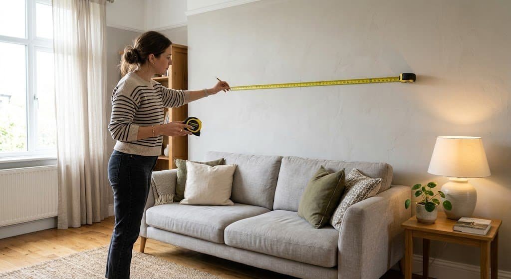
Step 1: Pick Your Wall (And Measure It)
Before you buy a single frame, pick your wall. Not every wall is a gallery wall wall.
Great gallery wall locations:
- Above a sofa (the #1 spot)
- Going up a staircase
- A long hallway
- Above a console table in an entryway
- Above a bed (if no headboard)
Bad gallery wall locations:
- Walls with lots of windows or doors breaking them up
- Walls narrower than 4 feet (you cannot fit enough frames)
- Walls that are already crowded with other stuff
Measure the wall. Write down the width and height of the available space. You will use these numbers constantly while planning. A typical gallery wall above a sofa should span about 2/3 of the sofa’s width. So if your sofa is 84 inches wide, your gallery wall should be roughly 56 inches wide total.
Step 2: Choose Your Style (This Changes Everything)
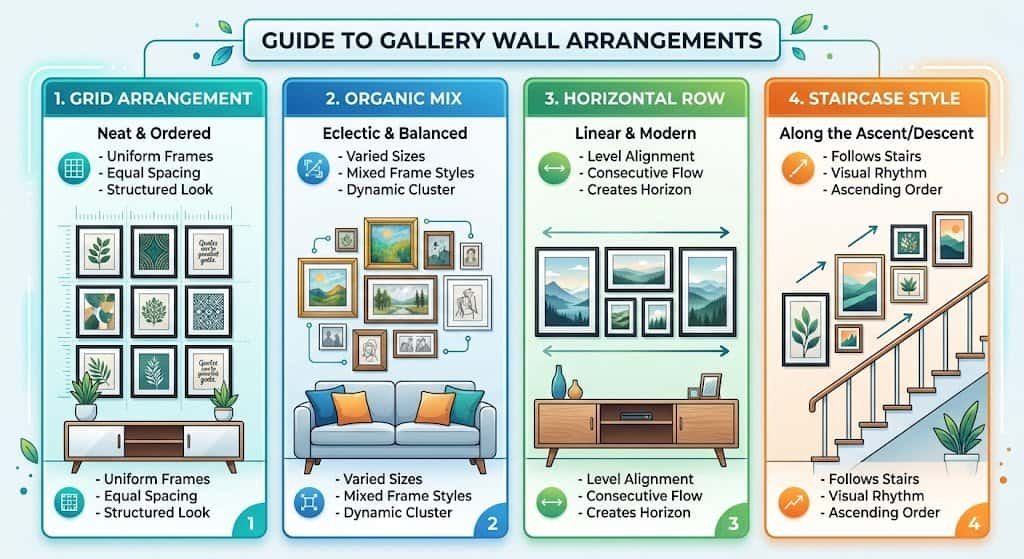
There are really only four main gallery wall styles. Picking one upfront saves you from the “bunch of random frames” look that doesn’t work.
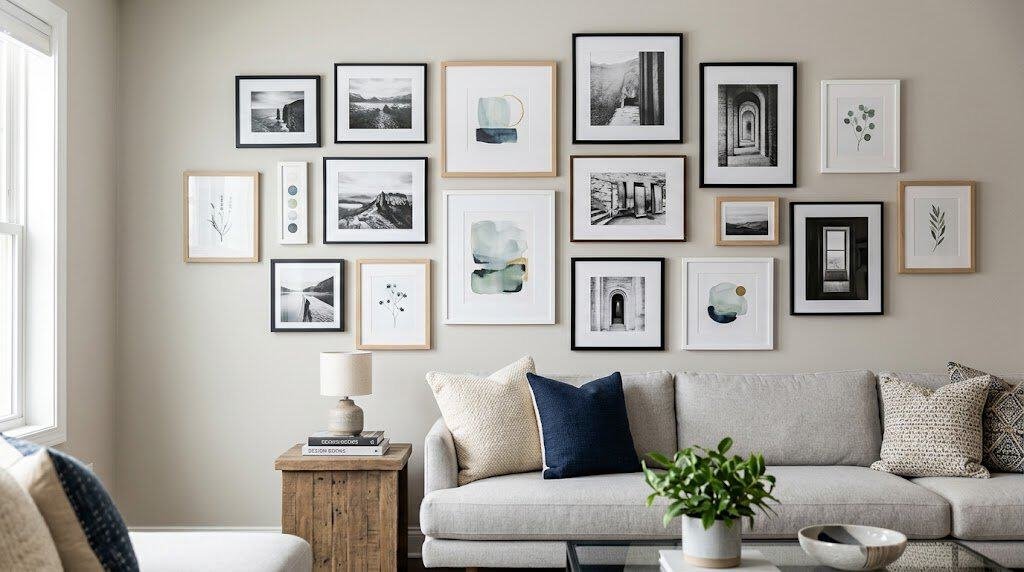
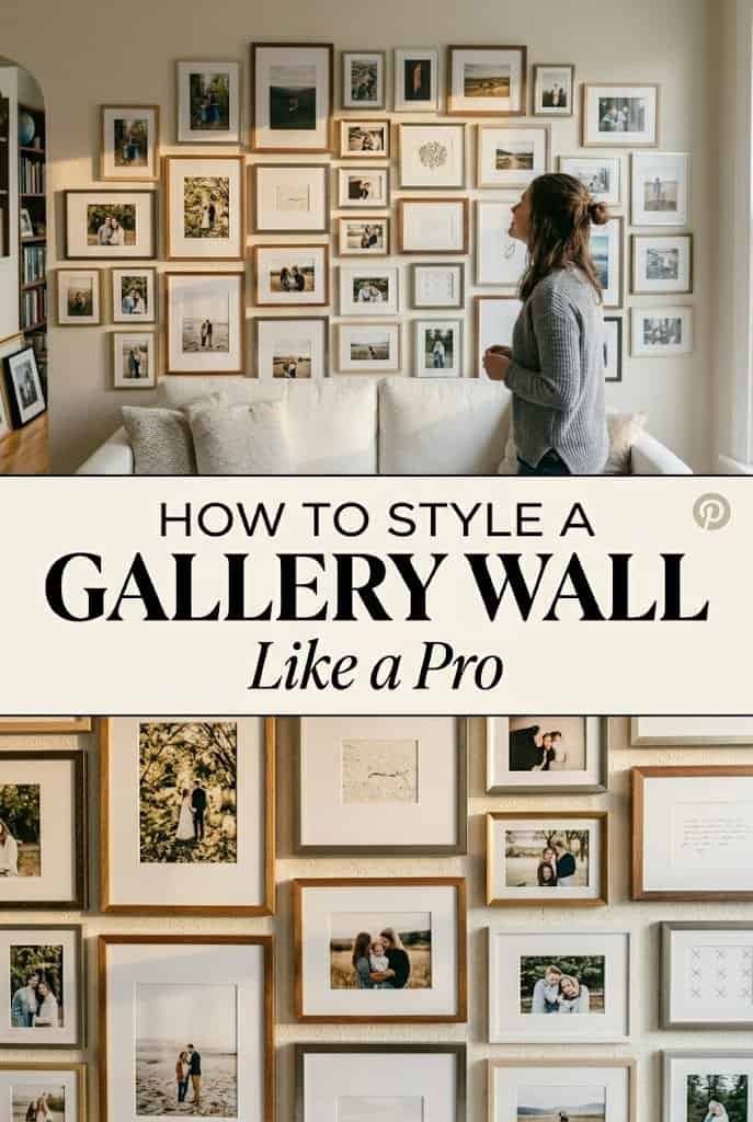
Style 1: Symmetrical Grid
All frames the same size, arranged in a perfect grid (3×3, 4×2, etc.). Very clean, very modern. The easiest style for beginners because spacing is uniform. Best for: modern homes, minimalist rooms, above-sofa arrangements.
Style 2: Salon Style (Organic Mix)
Mixed frame sizes, colors, and orientations, arranged asymmetrically but intentionally. This is what you see in English country homes, European apartments, and design magazines. Harder to pull off but more interesting. Best for: eclectic homes, homes with lots of art collected over time, hallways.
Style 3: Horizontal Row
A row of frames at the same height, all spaced evenly. Clean, linear, calm. Great for long horizontal spaces like hallways or above a console table. Best for: hallways, over a long credenza, modern spaces.
Style 4: Staircase Ascending
Frames that climb up a wall diagonally, usually following a staircase. Each frame a bit higher than the last. Best for: going up staircases (obviously), creating movement.
Pick one. Do not mix styles on the same wall. Mixing is how you end up with the chaotic look that nobody intends.
Step 3: Choose a Frame Strategy
This is where most gallery walls succeed or fail. The frames themselves need a connecting thread, otherwise the wall looks chaotic.
Pick one of these three strategies:
Strategy A: Same Color, Different Sizes
All frames are black. Or all frames are natural wood. Or all frames are gold. The color is the connecting thread, but the sizes vary. This is the easiest strategy and works for almost any room.
Strategy B: Same Size, Different Colors
All frames are the same 11×14 size, but some are black, some are white, some are gold. The size is the connecting thread. Works best for symmetrical grid layouts.
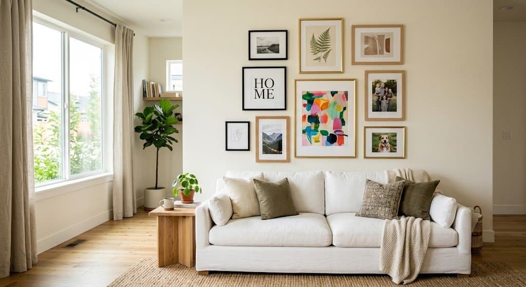
Strategy C: Mixed Everything, But One Rule
Mixed colors and sizes, but every frame has something tying them together — maybe all frames have a white mat, or all frames are wooden (even if different shades), or all the art is black and white. One visual rule.
I have done all three. For my first successful gallery wall, I went with Strategy A — all black frames, mixed sizes. Clean and foolproof.
For a client’s eclectic living room last year, we did Strategy C — wildly mixed frames, but every single piece of art inside them was black and white. That unified everything even though the frames were all different.
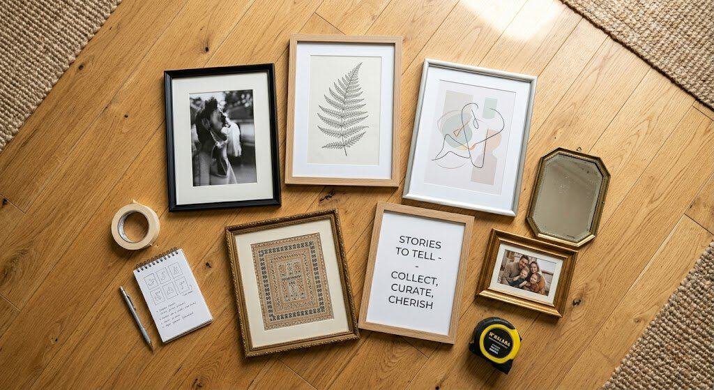
Step 4: Pick Your Art
Now for the actual art. You need roughly 7 to 12 pieces for a typical gallery wall. More can work for bigger walls, but under 7 usually feels sparse.
Where to source art:
- Etsy — massive selection of printable art. Buy digital downloads for $5 to $15, print them yourself at Staples for $2 each. A whole gallery wall of art for under $100.
- Society6 and Redbubble — ready-to-frame prints from independent artists. $20 to $40 per print.
- Thrift stores — weekly trips to Goodwill or Salvation Army can turn up incredible vintage art for $3 to $10 each. My favorite source.
- Your own photos — family photos, your own photography, travel pictures printed large and framed. Deeply personal.
- Kids’ art — one piece of your kid’s art, framed and hung on a gallery wall, hits emotionally in a way nothing else does.
- Free printables — Pinterest has thousands of free printable art downloads. Search “free printable art” and filter by the style you want.
The mix that works best:
- 2 to 3 pieces of “main” art (the focal point pieces)
- 3 to 4 smaller supporting pieces
- 1 to 2 personal elements (a family photo, a concert ticket in a shadow box, a handwritten note)
- Variety in orientation — some vertical, some horizontal, some square
Do not put all the same type of art up. An all-photographs wall is boring. An all-abstract wall is stark. A mix of photography, illustration, typography, and maybe one 3D element (like a mirror or framed textile) is what makes gallery walls interesting.
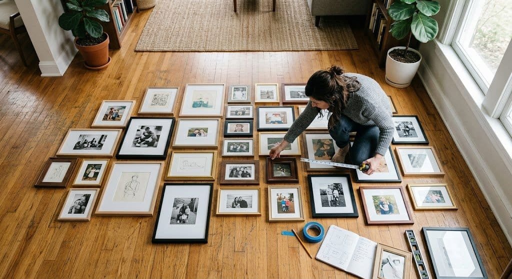
Step 5: Plan the Layout on the Floor
This is the step I mess up the first time. Now it is non-negotiable.
Clear a space on the floor that’s roughly the size of your wall. Lay out all your frames in the arrangement you think you want.
Layout rules that actually work:
- Start with your biggest piece. Put it slightly off-center — not dead center. Off-center-anchoring creates visual interest.
- Keep spacing consistent. Whatever gap you leave between frames (typically 2 to 3 inches), keep it the same everywhere. Uneven gaps look sloppy.
- Balance visual weight. If you have dark heavy frames, spread them out evenly across the arrangement — don’t cluster them on one side.
- Think about horizontal and vertical balance. A gallery wall where all the verticals are on the left and all the horizontals are on the right feels off-balance. Mix them.
- Odd numbers look better than even numbers. Seven, nine, or eleven pieces feels more natural than eight or ten. It is a weird design rule but it’s real.
Rearrange until it looks right. Take a photo on your phone, then squint at the photo. Your eye notices problems in a photo that you miss looking at the floor directly. Move things. Try three or four arrangements before settling.
This step takes 30 to 60 minutes. Do not rush it. This is the most important step in the whole process.
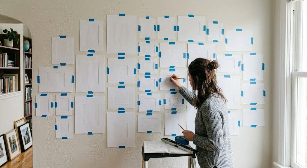
Step 6: The Paper Trick (Zero Extra Nail Holes)
Here is the single best trick in this entire article. Once you have your floor layout figured out, do not transfer it to the wall directly.
Instead:
- Trace each frame onto a piece of craft paper or newspaper. Cut out paper templates the exact size of each frame.
- Mark on each paper template where the nail or picture hanger will go (based on the frame’s hanger).
- Tape the paper templates to the wall in the arrangement you planned.
- Step back and look. Adjust. Move templates around if the arrangement does not translate well from floor to wall.
- Once you love the paper layout, nail through the marked spot on each paper template.
- Pull the paper off, hang the actual frame on the nail.
This trick has two magical benefits: you end up with zero extra nail holes because you only nail where you want the frames, and you get to see the full arrangement on the actual wall before committing.
I have hung six gallery walls this way. Zero do-overs. Zero extra holes.
Step 7: Hang the Frames
Once your paper templates are in place and marked, hanging goes fast. About 30 minutes for a full gallery wall.
Tools you need:
- Hammer
- Measuring tape
- Level
- Pencil
- Nails or picture hangers (appropriate for your wall type)
For drywall: Basic nails or 3M Command strips work for frames under 5 pounds. For heavier frames, use picture hangers rated for the weight.
For plaster walls: Always pre-drill a small pilot hole to prevent cracking. Use anchors for anything over 5 pounds.
For brick or concrete: You need a masonry drill bit and anchors. This is a bigger project.
Start with the biggest, most central frame first. Get it perfectly level. Then work outward from there, hanging the surrounding frames. Use your level for every single frame, not just the first one.
One detail most guides skip: check each frame from across the room, not up close. Close up, every frame looks level. From 10 feet back, small tilts become obvious.
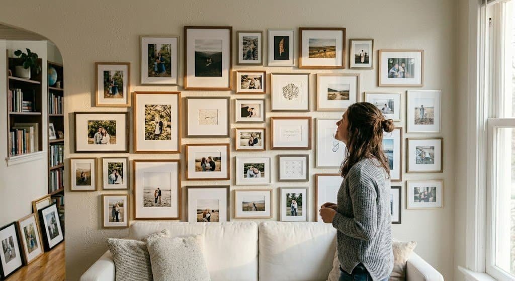
Step 8: Live With It for a Week, Then Adjust
Nobody gets a gallery wall perfect on day one.
Hang the full wall. Then live with it for a week. Every time you walk through the room, look at it with fresh eyes. What is bothering you? Is one frame slightly too low? Is there a gap that’s off? Does one piece of art feel out of place with the others?
Make one or two small adjustments. A frame moved two inches can transform the feel of the whole wall.
My living room gallery wall took three weeks to feel “done.” I moved three frames over that period. Looking at it now, I could not tell you which ones moved or where they started. The small adjustments disappear and all you see is the finished, intentional result.
Common Gallery Wall Mistakes (And How to Avoid Them)
After doing this six times, I have noticed the same mistakes come up over and over. Here are the top ones:
Mistake 1: Frames too close to the ceiling or too close to the sofa.
Gallery walls need breathing room. Leave at least 8 to 10 inches between the top frame and the ceiling, and 6 to 10 inches between the bottom frame and the top of the furniture below.
Mistake 2: Center of the gallery wall too high.
The visual center of the gallery wall should be around 57 to 60 inches from the floor. Too high is the most common mistake. You want the art at eye level for a standing adult.
Mistake 3: All frames the same shape and orientation.
A wall with nine identical horizontal rectangles arranged in rows looks like a DMV office. Mix orientations — some vertical, some horizontal, some square.
Mistake 4: Random spacing.
If one gap between frames is 1 inch and the next gap is 3 inches, the whole wall looks chaotic. Consistent spacing is what makes organic layouts look intentional.
Mistake 5: No personal elements.
A gallery wall with zero personal items is just store-bought art on a wall. Every gallery wall I have loved includes at least one personal item — a family photo, a piece of kid’s art, a meaningful souvenir. That is what makes it feel like your wall.
Budget Breakdown
A full gallery wall can cost wildly different amounts depending on choices. Here is a realistic breakdown:
| Item | Budget Version | Mid-Range | Splurge |
|---|---|---|---|
| Frames (9) | $80 (Amazon) | $180 (Target) | $400 (Pottery Barn) |
| Art prints | $20 (digital + print yourself) | $100 (Etsy ready prints) | $300 (original art) |
| Supplies (nails, level) | $15 | $15 | $15 |
| Total | $115 | $295 | $715 |
My honest recommendation: start mid-range. Decent Target or Amazon frames look great and hold up for years. Save the splurge money for one or two really nice pieces of art in the mix.
Frequently Asked Questions
How high should a gallery wall be hung?
The visual center of the gallery wall should be 57 to 60 inches from the floor. This is “gallery height” — the eye level for an average standing adult. Too high is the #1 mistake. The bottom of the lowest frame should be 6 to 10 inches above the top of any furniture below.
How much space should be between frames on a gallery wall?
2 to 3 inches of consistent spacing works for most gallery walls. Less than 2 inches feels cramped. More than 3 inches makes the arrangement feel disconnected. The key is consistency — whatever gap you choose, keep it the same everywhere.
How many frames do I need for a gallery wall?
For a typical living room wall above a sofa, 7 to 12 frames works well. Fewer than 7 usually feels sparse. More than 12 on a single wall can feel cluttered. The exact number depends on wall size and frame sizes.
Can I do a gallery wall in a rental?
Yes. Use 3M Command strips or picture hanging strips for frames under 5 pounds — they hold securely and leave no damage when removed. For heavier frames, small nail holes (pencil-tip size) are usually fine; you can fill them with a dab of spackle when moving out.
Should all frames on a gallery wall match?
Not necessarily. You can have all matching frames (simple, modern look), or mix them with one unifying element — same color but different sizes, same size but different colors, or all different but unified by the art being similar in tone. What does not work: completely random frames with completely random art. Some connecting thread is essential.
How long does it take to hang a gallery wall?
Plan for 3 to 4 hours total. Roughly 1 hour to arrange on the floor, 1 hour to make paper templates and tape them up, 30 minutes to nail and hang. Add more time if you want to step back and adjust between steps.
What if my wall is an unusual color?
Colored walls can work beautifully for gallery walls — sometimes better than white. Dark navy, forest green, or warm terracotta walls make frames and art pop dramatically. Just make sure your frames contrast with the wall color. Black frames on a black wall disappear.
Related Articles
- 25 Stunning Outdoor Patio Ideas for Summer 2026
- Spring Home Refresh: 15 Easy Updates Under $50
- 20 Small Balcony Decor Ideas That Maximize Space
- 16 Best Outdoor Rugs for Patios and Decks
Tell me about your gallery wall in the comments — are you planning one, or do you have one you love?


")